Barrio Family Health Centers wanted an overhaul their brand to change public perception and stop being thought of as "that place that treats the uninsured or low-income people" of San Antonio.
Barrio Family Health Centers wanted an overhaul their brand to change public perception and stop being thought of as "that place that treats the uninsured or low-income people" of San Antonio.
Deliverables: design, creative direction, naming, messaging, and consultation
↓

Barrio Comprehensive Family Health Center's history started with Sister Dolores’ unconditional love to provide care for those in need. Sister Dolores Girault, D.C., a retired nurse and pharmacist, realized there was an increasing need for healthcare especially for those on the West side of San Antonio. So, she solicited support and acquired funding to operate a two-exam room pediatric clinic in the back of a local church to care for children in need.
As Barrio's services expanded into a comprehensive primary and specialty healthcare system, and as the healthcare continued to evolve, they realized they needed to rebrand. This included adopting a new name, a fresh identity system, and an entirely updated look to better reflect their future direction.
Logo and naming explorations integrated colors synonymous with healthcare and names that did not move the organization too far from its community roots.
We landed on a name and a mark that showcased the desire to move into the future while also nodding to their community-based roots and desires to continue to be a facility to provide families with the care they need, making them feel at home as much as possible so they can get well and stay well


COMMUNICARE HEALTH CENTERS
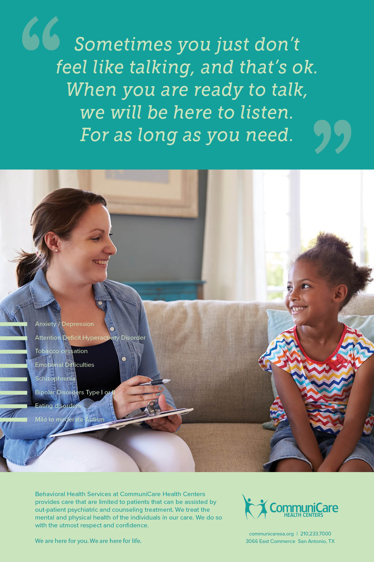
After conducting a brand audit of their collateral materials, the team and I crafted a visual vocabulary and brand voice for Communicare. While emphasizing their professionalism was essential, we infused their brand voice with a touch of sly humor. The outcome is a collection of collateral pieces that are bright, informative, easy to digest, and evoke emotions ranging from funny to heartwarming.

← prev
next →