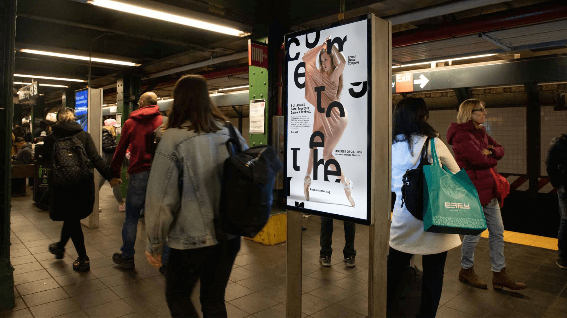
Collaborated with Koresh Dance Company on a fast-paced project to promote a five-night festival celebrating Philadelphia's rich and diverse artistic landscape.
Collaborated with Koresh Dance Company on a fast-paced project to promote a five-night festival celebrating Philadelphia's rich and diverse artistic landscape.
Deliverables: design, creative direction, and consultation
↓
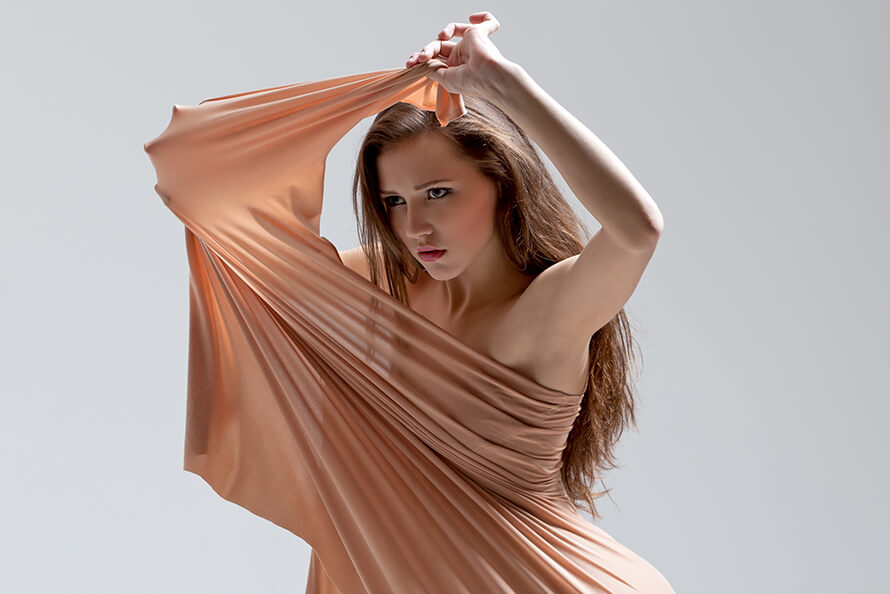
Koresh Dance Company (KDC) is renowned for its captivating performances and exceptionally skilled dancers. With critically acclaimed productions staged in Philadelphia and nationwide, KDC has also garnered international acclaim through tours to Spain, Turkey, Israel, South Korea, Mexico, and Guatemala.
Challenge:
How can we rapidly ideate, design, and develop a promotion for a five-day festival with limited time and resources?
STRATEGY
To engage viewers, by captivating them with intriguing visuals and stimulating their imaginations, prompting them to decipher the headline and encouraging interaction.
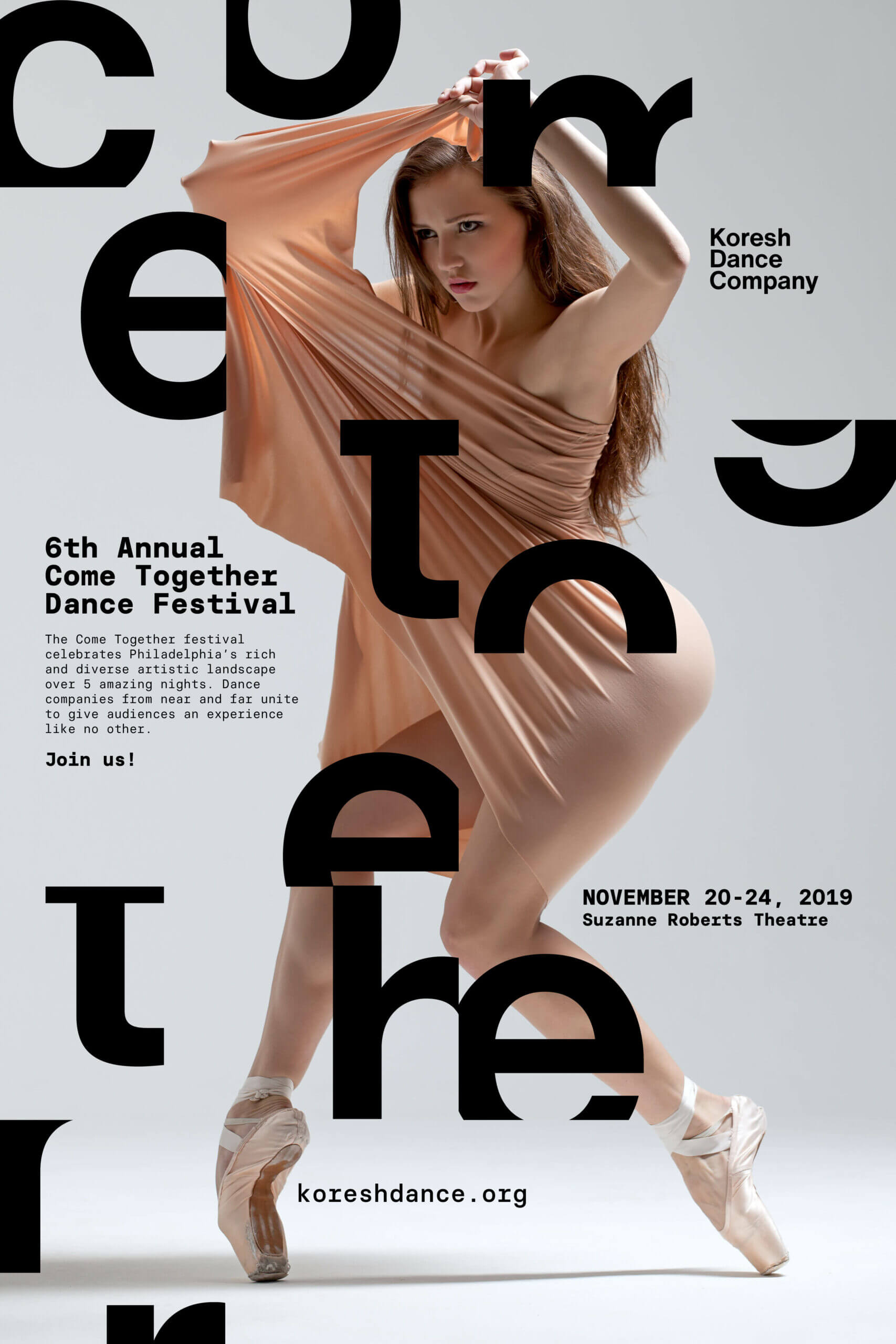
Given the limited photography available, my team and I decided to enhance our designs by incorporating graphic elements to increase visual interest and engage viewers. We began by exploring Helvetica Now, the latest revision of the classic Helvetica typeface.
Due to its strong association with the New York dance scene, we felt Helvetica was an ideal choice for this promotion. The alternate letterforms in Helvetica Now also provided us with additional variety to experiment with.


After experimenting with Helvetica Now, we decided to deconstruct the letterforms to suggest movement and emphasize the concept of the forms coming together.

Finally, we examined how much of the letterforms could be removed while still maintaining their recognizability and readability when placed near other letters. We relied on Gestalt principles of proximity and closure to predict the public's ability to piece the words together.
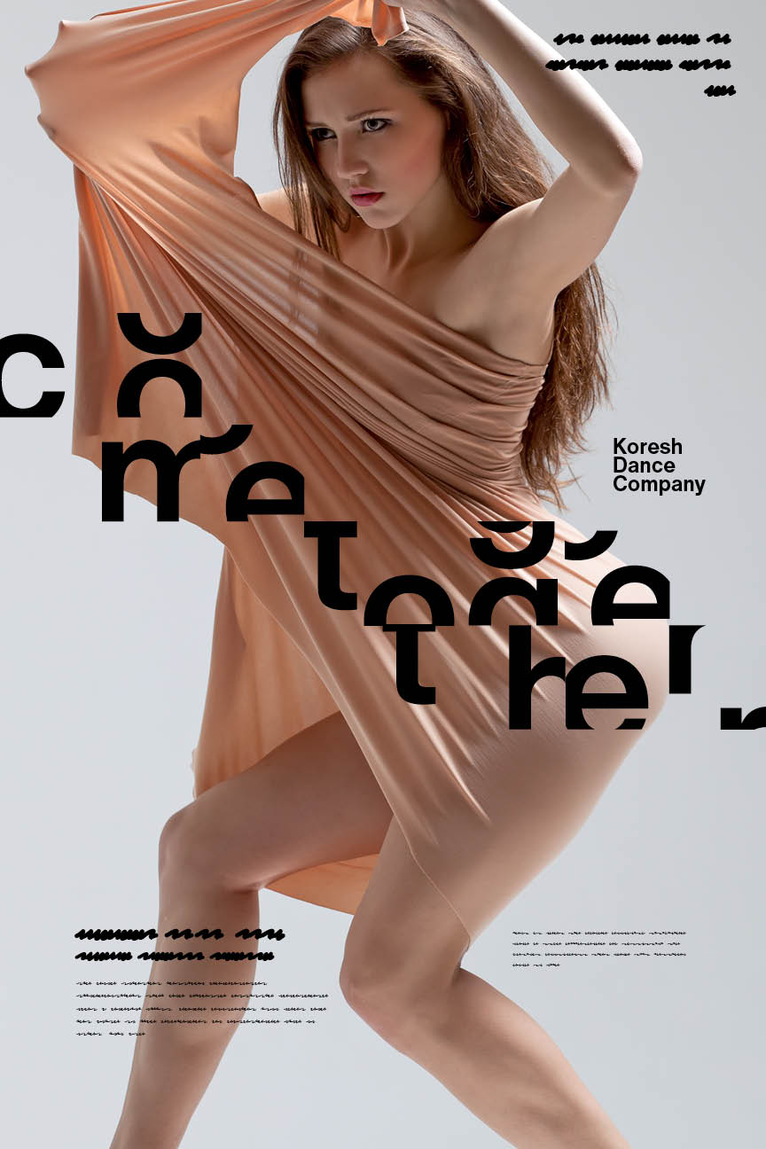
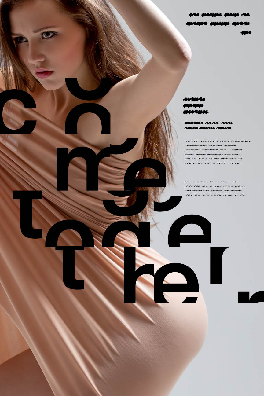
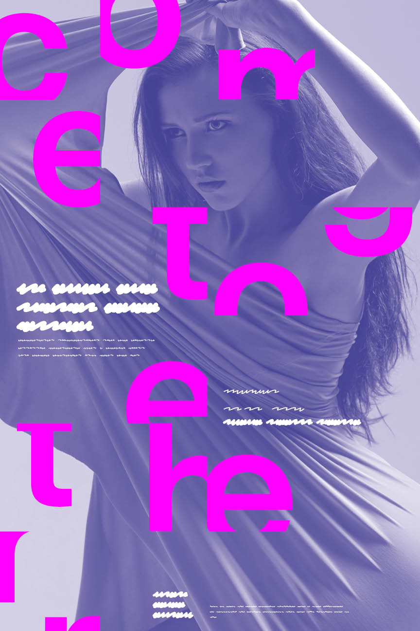
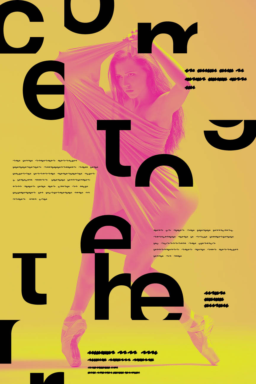

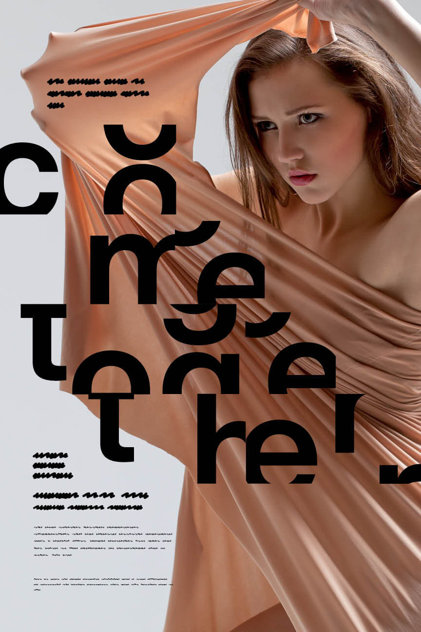
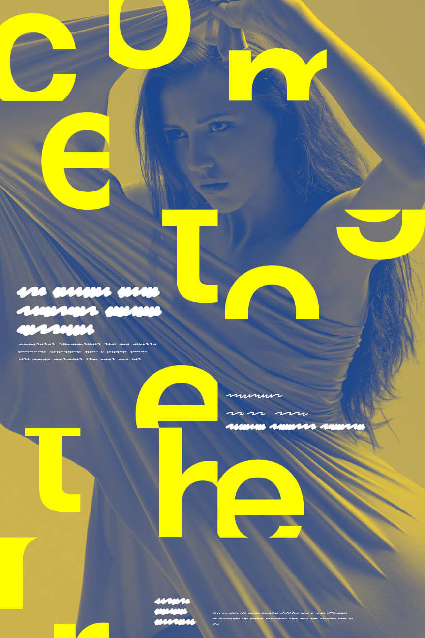
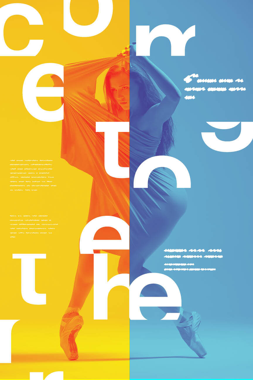
Once we agreed on the specific letterforms and their juxtaposition with the image, we explored various design elements to enhance the overall visual impact. We experimented with scale, adjusting the size of the letters and images to create a dynamic composition. We played with rhythm, arranging the elements to guide the viewer's eye smoothly across the design. Balance was another key consideration, ensuring that the visual weight was distributed to create a harmonious layout. Finally, we explored different color schemes to find interesting color palettes that would complement the forms and images, enhancing the overall aesthetic appeal and emotional impact of the design.
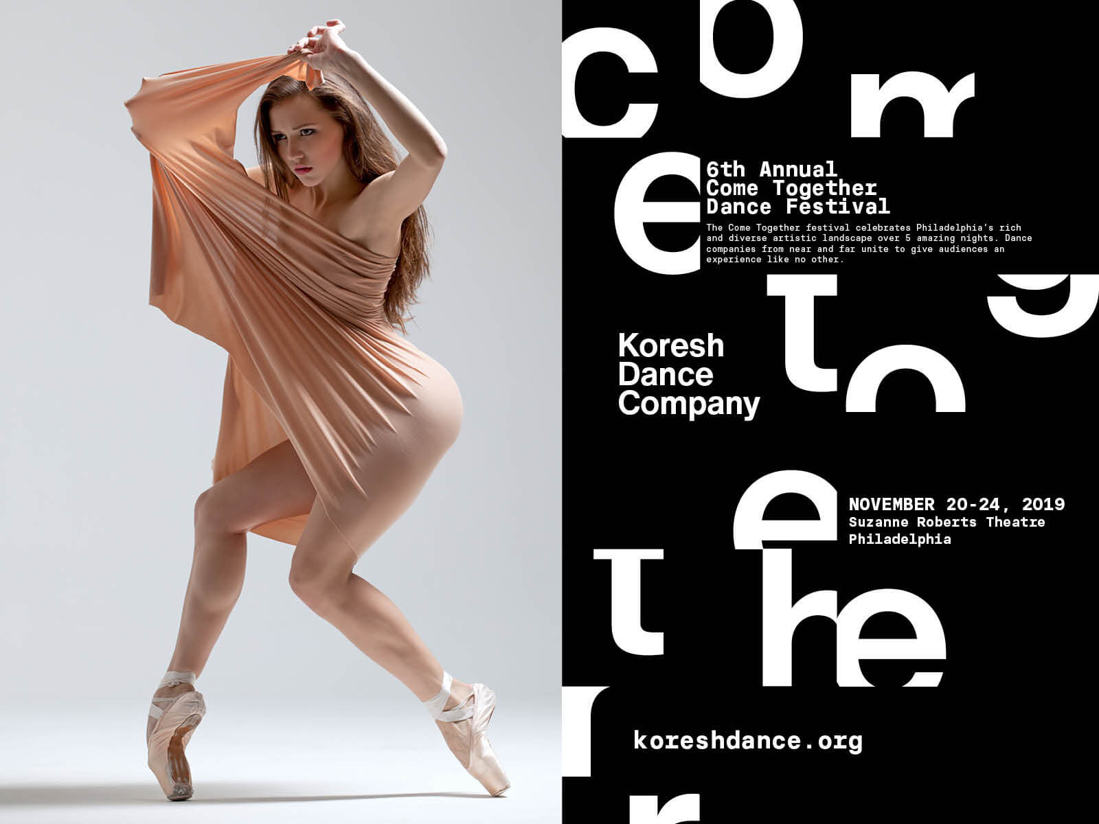
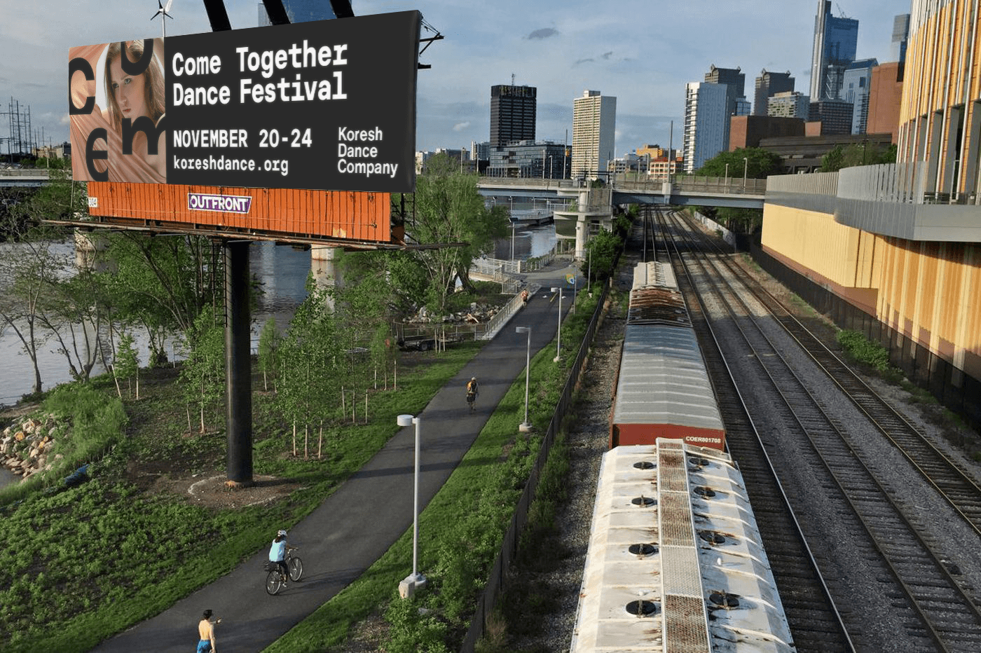
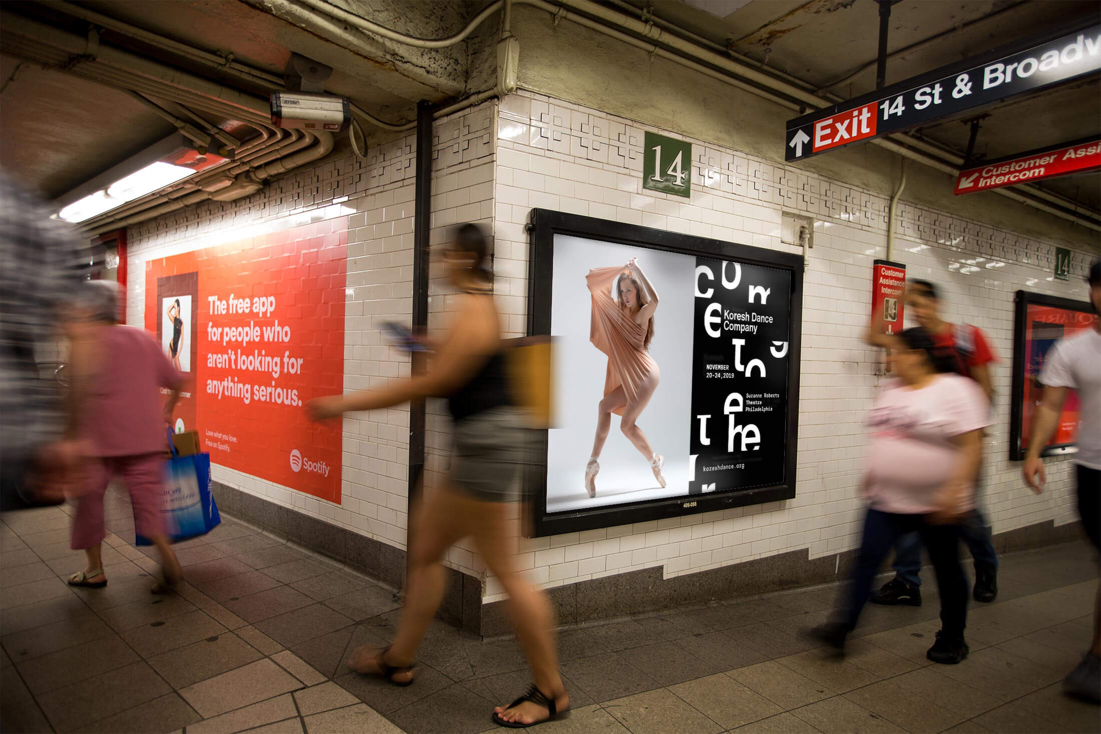
The approved designs were successfully implemented across Pennsylvania and New York to promote the festival. They were featured on a variety of platforms, including posters, out-of-home advertising, and social media, attracting attention and generating excitement for the event. The client confirmed a positive response from the public and affirmed the effectiveness of the event's creative branding approach.
← prev
next →