Where Identity Meets Intention: Bringing the UTSA Brand to Life for Future Students
UTSA Admissions asked for help creating a cohesive look and feel for all of their collateral materials. We synthesized the elements to develop a harmonious suite of deliverables.
Deliverables:
Visual strategy and system design, Multi-audience campaign architecture (Undergraduate & Graduate tracks), Scalable visual framework for seasonal reuse, Creative direction and messaging development, Consultation on cross-platform brand consistency (print, digital, social, and broadcast), Audience-specific engagement tactics and implementation guidelines
↓
UTSA ADMISSIONS — “YOU’RE IN”
A Strategic Visual System That Drove Enrollment, Engagement, and Excitement
Following our successful work on UTSA’s institutional rebrand, the Admissions Department engaged us to bring that identity to life through a cohesive and scalable suite of prospective student materials. The challenge: build a consistent and flexible system that worked across multiple platforms, departments, and audiences, without feeling templated.
Strategic Focus: Align the Brand With the Moment of Excitement
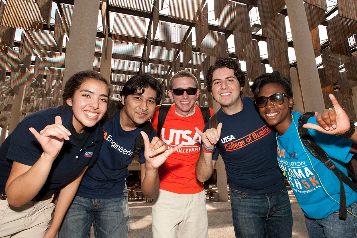
We created a unified communications framework that celebrated one of the most emotional milestones in a student’s life: acceptance. From high-energy Undergraduate campaigns to research-forward Graduate communications, every element was built to reflect the real experience of becoming a Roadrunner.
Undergraduate Campaign: Rally Energy + Real Excitement
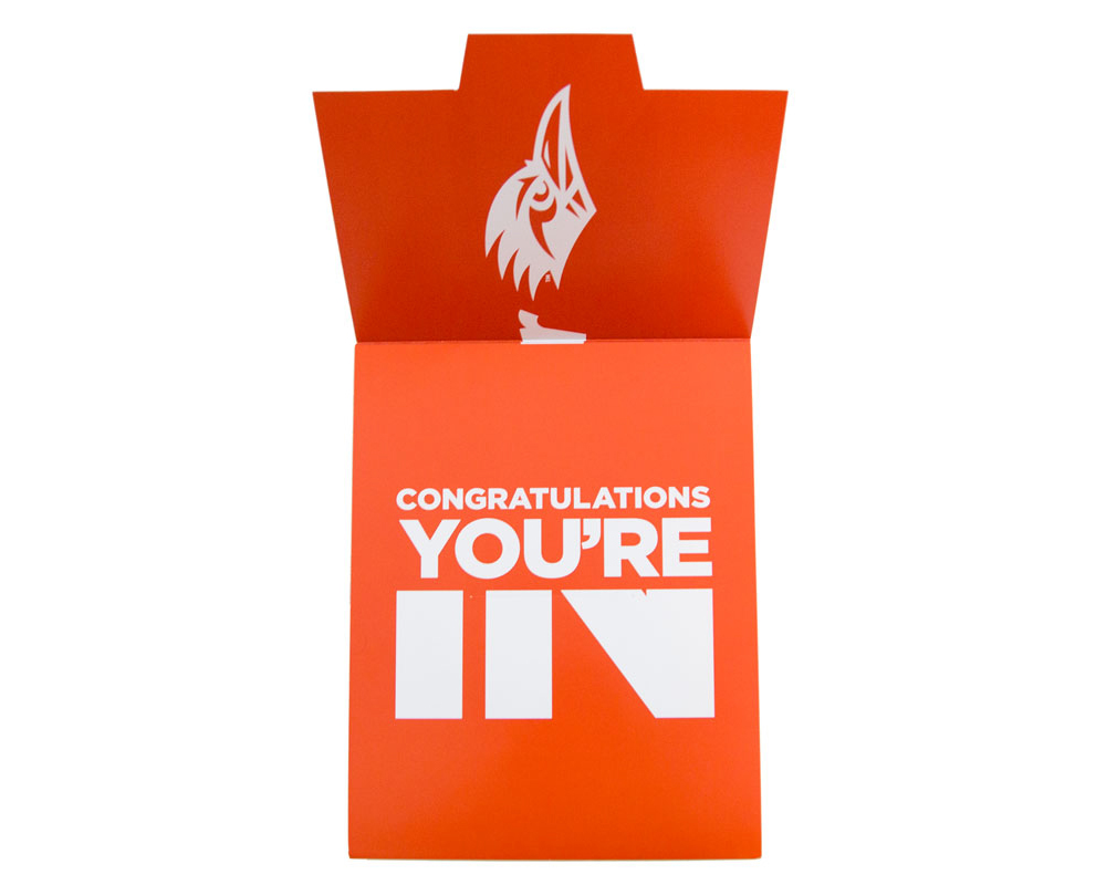
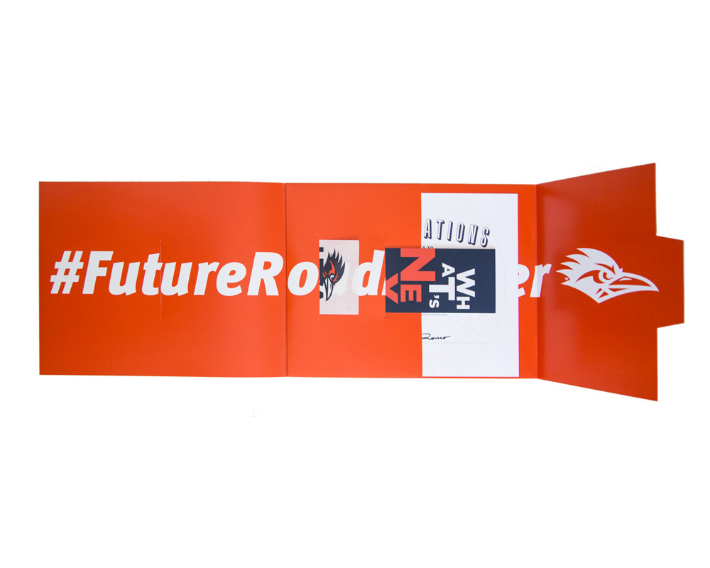
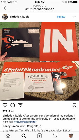
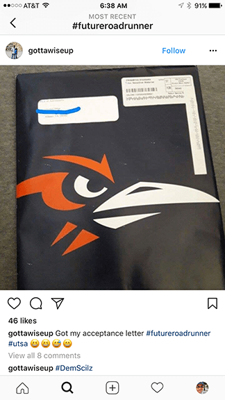
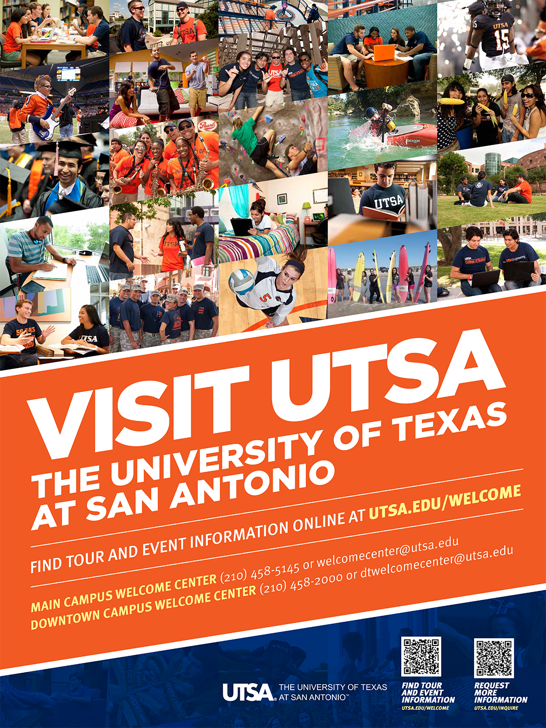
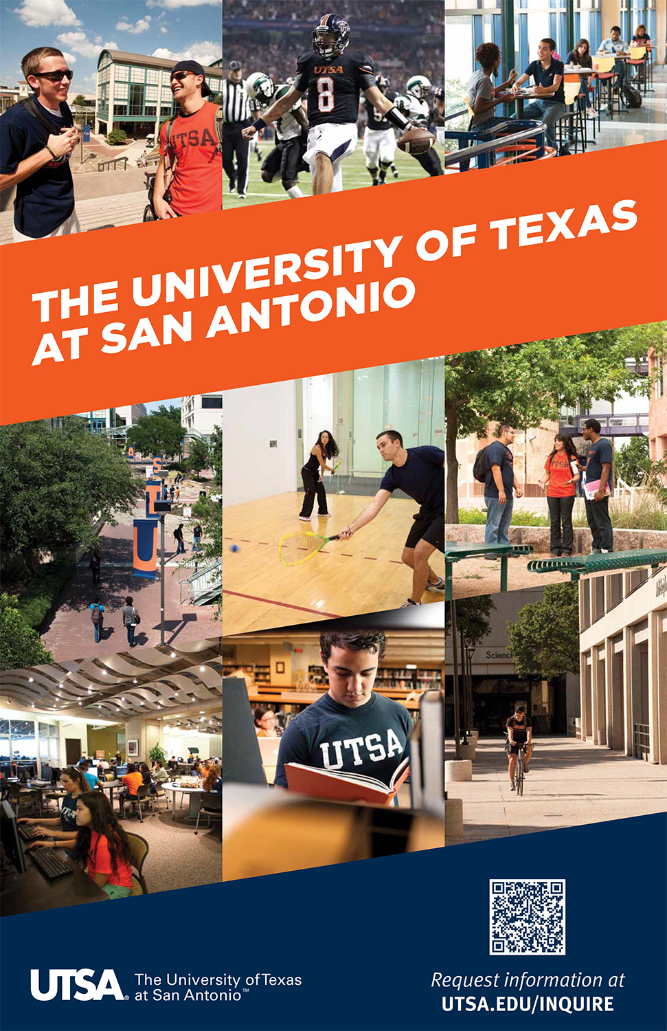
For undergrads, we led with bold visual design, branded orange and blue, and a campaign centered around the powerful moment of acceptance: "You're IN." The launch package included print mailers, social shareables, and video assets—all designed to evoke school spirit and game-day energy. A drum corps soundtrack, dynamic motion graphics, and quick-cut supers brought UTSA’s personality to life in broadcast and digital formats.
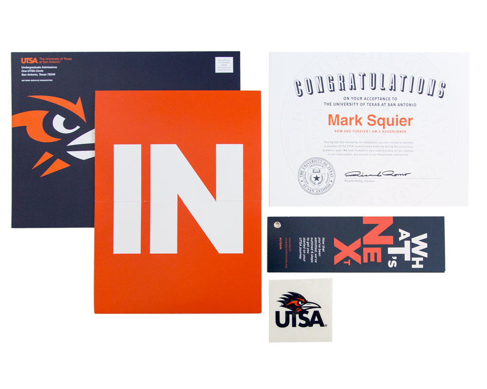
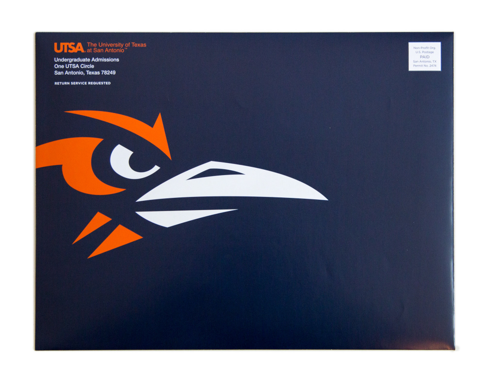
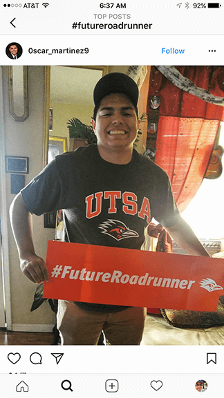
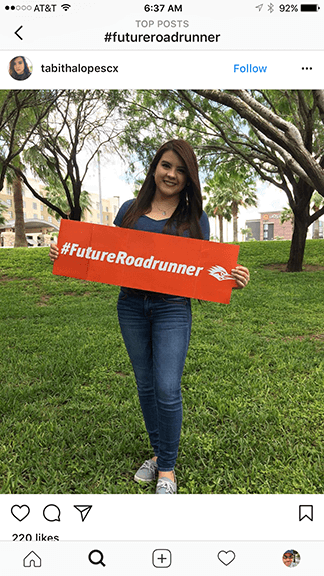
Impact: The “You’re IN” acceptance package became an instant social media phenomenon. Newly admitted students flooded platforms with posts and selfies using the hashtag #FutureRoadrunner, which continues to be one of UTSA’s most-used campaign tags during enrollment season.



Graduate Campaign: Smart, Strategic, and Research-Driven
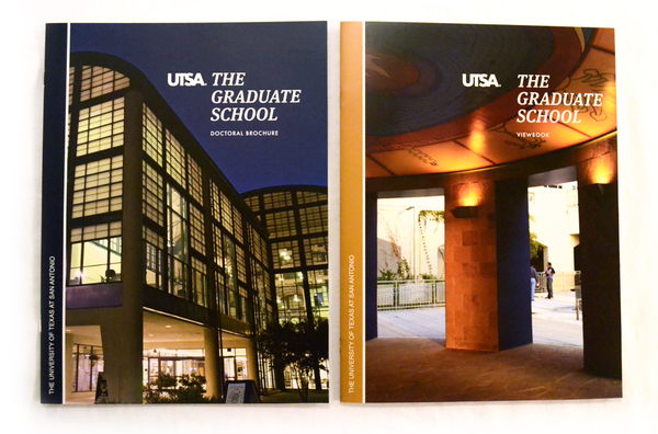
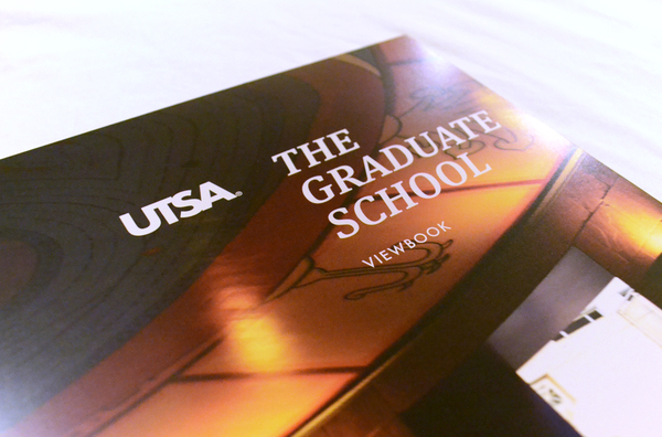
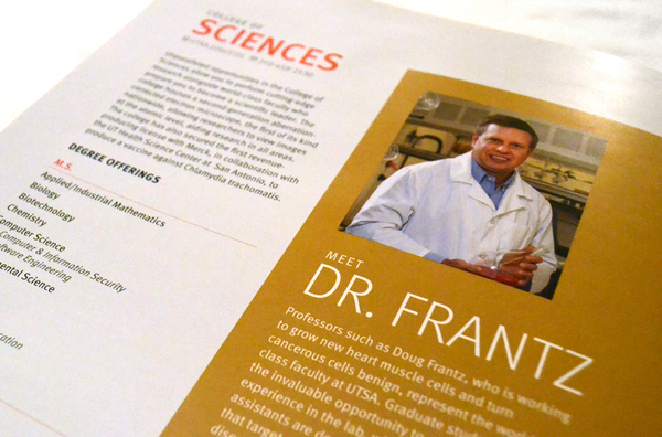
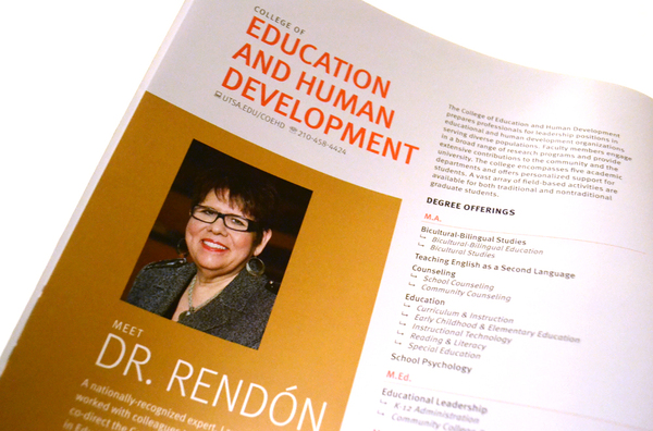
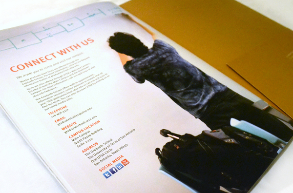
Graduate communications shifted in tone to emphasize academic depth and opportunity. These assets focused on faculty credentials, research excellence, and UTSA’s dual-campus model (main and downtown). Each print and digital touchpoint included QR codes that led directly to program-specific content and digital exploration, bridging physical and digital journeys seamlessly.

System-Wide Visual Strategy: Scalable, Seasonal, Smart
- Developed distinct yet cohesive visual languages for Undergraduate and Graduate audiences
- Standardized UTSA brand colors, type, photography style, and voice across all communications
- Built a system designed for seasonal re-use with minimal production changes
- Balanced inspiration with information to drive both emotional connection and practical clarity
Outcome:
What began as an admissions revamp became a blueprint for brand-wide engagement. The strategy proved so effective that it helped boost enrollment, inspired new social behaviors, and laid the foundation for how future communications would look, feel, and sound.
← prev
next →
Copyright © 2024 Eleazar Hernández | All Rights Reserved
